
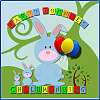
has to be the top one for me
cathy

 Thanks: 0
 Likes: 0
 Dislikes: 0
View Poll Results: Which one do you like, if any?
- Voters
- 22. You may not vote on this poll
-
Top
16 72.73% -
Bottom
4 18.18% -
Neither
2 9.09%
Results 21 to 39 of 39
Thread: Vote on logo deisgn
-
20-06-2008, 09:34 PM #21

 Full Access Member

- Join Date
- Dec 2007
- Location
- away with the fairies
- Posts
- 1,464
- Registered Childminder since
- sept 94
- Post Thanks / Like

 Re: Vote on logo deisgn
-
21-06-2008, 07:46 AM #22
Basic Member Access
- Join Date
- Dec 2007
- Location
- Chorley Lancs
- Posts
- 446
- Registered Childminder since
- Aug 07
- Post Thanks / Like
Re: Vote on logo deisgn
Top one! It looks really nice
-
21-06-2008, 07:49 AM #23
 Basic Member Access
- Join Date
- May 2007
- Posts
- 3,993
- Registered Childminder since
- Aug 07
- Latest Inspection Grade
- Good
- Post Thanks / Like
Re: Vote on logo deisgn
I prefer the top one now that I can actually see them!
-
21-06-2008, 07:51 AM #24
Basic Member Access
- Join Date
- May 2007
- Posts
- 3,993
- Registered Childminder since
- Aug 07
- Latest Inspection Grade
- Good
- Post Thanks / Like
Re: Vote on logo deisgn
I looked again and I prefer the bottom picture of the rabbit and the top font!
I just think that the picture goes better with the business name, if you're called Happy Bunnies then I think the picture maybe should be of a bunny?
-
21-06-2008, 07:53 AM #25
 Basic Member Access
- Join Date
- May 2007
- Location
- far, far, away...
- Posts
- 7,520
- Registered Childminder since
- Nov 06
- Latest Inspection Grade
- Outstanding
- Post Thanks / Like
Re: Vote on logo deisgn
Same! Originally Posted by Spangles

 Blaze x
-
21-06-2008, 08:22 AM #26
 Basic Member Access
- Join Date
- Mar 2008
- Location
- Duxford, Cambridgeshire
- Posts
- 134
- Registered Childminder since
- June 08
- Post Thanks / Like
Re: Vote on logo deisgn
I voted top, but I agree with others the pic on bottom one is better, see if you can have a jiggle around!!! just a thought
-
21-06-2008, 08:25 AM #27
 Basic Member Access
- Join Date
- May 2008
- Posts
- 2,883
- Registered Childminder since
- Sept 08
- Post Thanks / Like
Re: Vote on logo deisgn
Im asking for a re-jig of the top one to include a rabbit pic so watch this space
-
21-06-2008, 08:28 AM #28
Full Access Member
- Join Date
- Aug 2007
- Posts
- 31,017
- Post Thanks / Like
Re: Vote on logo deisgn
Me too! Originally Posted by Spangles
miffy xx
-
21-06-2008, 09:02 AM #29
 Administrator
- Join Date
- May 2006
- Location
- in denial
- Posts
- 22,766
- Registered Childminder since
- 1984
- Latest Inspection Grade
- Outstanding
- Post Thanks / Like
Re: Vote on logo deisgn
I like the bottom one with the rabbit pic too, but not the rest of the 'childminding' word. Would be best in the same font but keep the rabbit, he's cute.
BTW you should turn amber at the end of the month! Pauline x
-
21-06-2008, 09:05 AM #30
Basic Member Access
- Join Date
- May 2008
- Posts
- 2,883
- Registered Childminder since
- Sept 08
- Post Thanks / Like
Re: Vote on logo deisgn
Im not sure what that means but it sounds quite painfulBTW you should turn amber at the end of the month!

-
21-06-2008, 09:35 AM #31
Full Access Member
- Join Date
- Sep 2007
- Posts
- 6,701
- Registered Childminder since
- Apr 08
- Latest Inspection Grade
- Outstanding
- Post Thanks / Like
Re: Vote on logo deisgn
I voted top
-
21-06-2008, 09:39 AM #32
 Basic Member Access
- Join Date
- Jan 2008
- Location
- Planet Lottie!
- Posts
- 309
- Registered Childminder since
- Apr-08
- Latest Inspection Grade
- good
- Post Thanks / Like
Re: Vote on logo deisgn
I voted for the top one. It's clear and to the point.
Love the bottom one but the font is too difficult to read.
-
21-06-2008, 07:02 PM #33
 Basic Member Access
- Join Date
- Dec 2007
- Location
- stalking monkey
- Posts
- 3,828
- Registered Childminder since
- Aug 06
- Post Thanks / Like
Re: Vote on logo deisgn
Top with a rabbit!
***** proofed the house but they're still getting in!
-
22-06-2008, 07:37 AM #34
 Basic Member Access
- Join Date
- Jun 2008
- Location
- South Lanarkshire
- Posts
- 1,829
- Registered Childminder since
- May-09
- Post Thanks / Like
Re: Vote on logo deisgn
top one...it's easier to read..
I love bunnies!!
-
22-06-2008, 07:42 AM #35
 Full Access Member
- Join Date
- Dec 2007
- Location
- North Notts
- Posts
- 2,735
- Registered Childminder since
- Nov 90
- Latest Inspection Grade
- Outstanding
- Post Thanks / Like
- Blog Entries
- 1
Re: Vote on logo deisgn
I like the bottom one, I like the way the Childminding looks like the bunny's body
Cx
-
22-06-2008, 07:46 AM #36
 Full Access Member
- Join Date
- Jan 2008
- Location
- My own world cause it helps
- Posts
- 2,754
- Registered Childminder since
- June 07
- Latest Inspection Grade
- OUTSTANDING
- Post Thanks / Like
Re: Vote on logo deisgn
Top one with Rabbit
Celest
-
22-06-2008, 08:30 AM #37
 Basic Member Access
- Join Date
- Dec 2007
- Location
- Northants
- Posts
- 1,254
- Registered Childminder since
- Mar 10
- Latest Inspection Grade
- Good
- Post Thanks / Like
Re: Vote on logo deisgn
The bottom one has too many different font types and colours. The top half of it doesn't work with the bottom half if that makes sense. I prefer the font/colour of the top as it is bold and stands out.
I like the top one but as others have said, I like the bunny element of the other.
-
22-06-2008, 09:02 AM #38
 Basic Member Access
- Join Date
- Feb 2008
- Location
- Somewhere You Dont lol
- Posts
- 2,488
- Registered Childminder since
- Feb 09
- Latest Inspection Grade
- Satisfactory
- Post Thanks / Like
Re: Vote on logo deisgn
top one 4 me hehe x
To Dare Is To Do
-
22-06-2008, 10:05 PM #39
 Basic Member Access
- Join Date
- Mar 2008
- Location
- In my own little world
- Posts
- 225
- Registered Childminder since
- Sept 08
- Post Thanks / Like
Re: Vote on logo deisgn
Bottom one for me and like everyone said just change font of "Childminding"
Good Luck

 Reply With Quote
Posting Permissions
Quick Links and Advertisements
|


You can also find us on:


Bookmarks